
Levolytics Research #20: The Great Rinsing
Website Launch Imminent | Available to All Subscribers

Welcome to the newest edition of Levolytics Research! The home of actionable data. If you enjoy the research, please subscribe and share our work with friends and colleagues, and follow @levolytics + @permabullnino on X, the Everything App.
Website Launch
Our website launch will be on Thursday, February 12th
We will send out an email to all subscribers giving onboarding instructions to our paid and free subscribers
Paid subscribers will receive access to the website at no additional cost, it is included in the newsletter subscription as of this week
Free subscribers will each get a 30-Day free trial beginning at launch
We’re looking forward to getting feedback from users, and excited about providing more value to our followers at a great price
Our Take on the Market
We concluded our analysis last week with the following takeaway:
This feels like (1) the beginning of a straight line downwards in crypto, or (2) the bottom before an emphatic spring upwards. Consolidation was fun while it lasted, but the return of violence feels like a signal to market participants that it’s time to pay attention again.
Following publication, BTC dropped 20% in a matter of days in what looked like a run on the bank, as traders/investors flooded to their favorite exchange to sell their coins.
Last week was one to remember, and in some ways historically significant. Our goal for this week’s publication is to look through various data points to better understand if this is (1) the beginning of a continued straight line downwards for crypto or (2) the bottom before an emphatic spring upwards.
Data loading…and here we go!
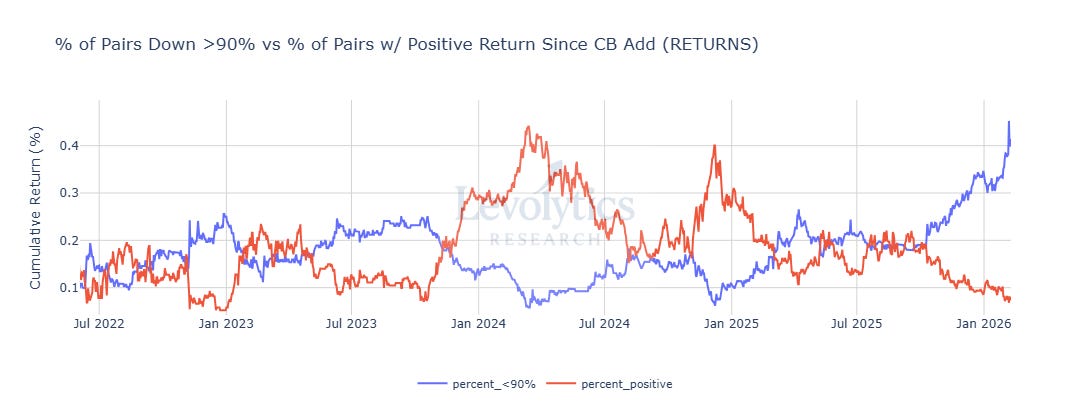
Metric: % of Pairs Down More Than 90% vs % of Pairs With Positive Returns Since Added to Coinbase
% of Pairs Down More Than 90% = Spiked to 45% on February 6th
Current value = 41%
Almost half of assets on Coinbase are down more than 90% since added to the platform for trading
% of Pairs With Positive Returns = Bottomed at 6.8% on February 6th
Current value = 8%
Almost all assets on Coinbase have a negative return since being added to the platform for trading
Metric Takeaway:
The end of year tax selling was supposed to provide some relief, right? Right?? Not so fast say the crypto gods!
All jokes aside, the % of pairs down more than 90% was at 33% on January 1st - so the population of “down bad” assets increased by 33% in January / early February alone.
It feels like a lot of assets (and likely teams along with them) are on the brink of collapse. We wouldn’t be surprised to see some of these assets mildly rebound, but generally continue to drift lower over time.
This commentary isn’t necessarily an indictment for all of crypto - but more so a reminder that traders / investors need to remain hypervigilant as it relates to which assets they pour their hard earned money into. Some of these assets are genuinely cooked.
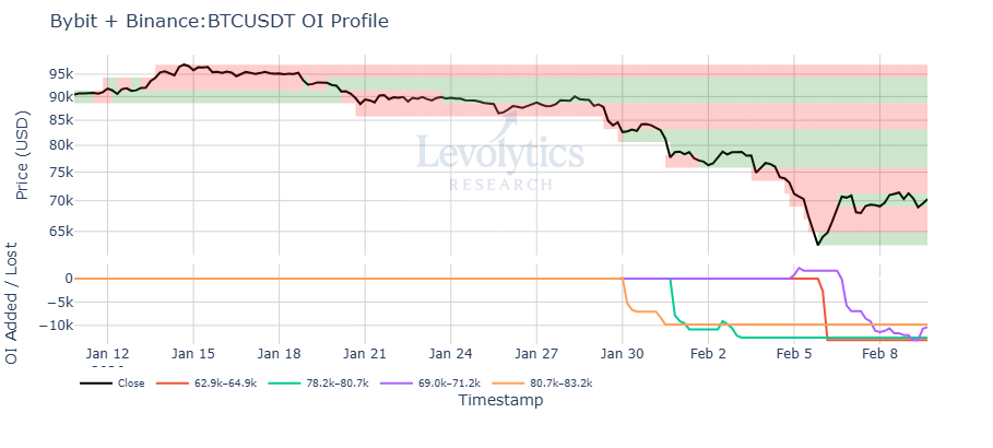
Metric: BTCUSDT Open Interest Profile Over Past 30 Days (Using Binance + Bytbit Data)
Green zones = Open interest decreased here
Red zones = Open interest increased here
Subplot displays the 4 zones with the lowest open interest added / lost over the past 30 days
First drop in OI = $81k to $83k range
OI down | Price down | range lows tested + bulls panicking
Second drop in OI = $78k to $81k
OI down | Price down | “safe stop losses” tagged
Third drop in OI = $63k to $65k
OI down | Price down | pure panic + shorts closing
Fourth drop in OI = $69k to $71k
OI down | Price up | late shorts must pay
Metric Takeaway:
We believe this provides a useful visualization for what took place last week on a psychological basis. Generally speaking, derivatives data is great for tracking emotions / psychology in markets due to their ability to magnify gains / losses.
It’s pretty clear that there was a large swath of traders who didn’t believe range lows at $80,000 would be approached for a second time. This surprise likely pushed things over the edge and created the conditions for the rare -14% daily candle BTCUSD had on February 5th.
The big question from here (now that late shorts got cleaned out at $70,000) is if $60,000 is in the cards, or if the market makes a move back up to the initial “surprise level” around $80,000.
This chart is one to watch moving forward as the market remains emotionally geared - and remember to track green boxes for areas where market participants are caught on their heels.
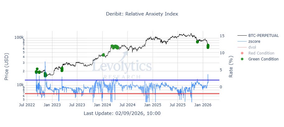
Metric Description:
Metric: BTCUSD vs Relative Anxiety Index
Relative Anxiety Index (Blue line) = 200-Day Z-Score of DVOL Minus BTC-PERPETUAL Annualized Funding Rate on Deribit
DVOL = 30 day (forward-looking) annualized expectation of volatility
Green dots = DVOL is much higher than funding rates
Green dots = very high levels of anxiety in the market = values > +2
Most recent green dot = February 7th, 2026
These generally occur during large liquidation events / market bottoms
Expectations of volatility > demand for perpetual swaps exposure
Current value = 1.21 | Peak value = 3.47
Largest deviation outside the mean since FTX collapse in November 2022
Note: DVOL & Annualized Funding Rates do not need to be equal. This metric measures the trend and large dislocations from the historical trend.
This metric was previously introduced in Levolytics #14
Metric Takeaway:
This metric sums up the tidal wave of anxiety that has overwhelmed crypto for months now:
4 year cycle believers convinced it’s over
DAT froth signals
Quantum paranoia
Altcoins already down terribly
Equities + metals (particularly gold) taking the spot light
There’s certainly more that we could add to this list, but this dislocation in the Relative Anxiety Index is pure emotion displayed on a price chart.
We’ve said this many times before, but it is worth saying again for any new readers:
Trends cannot end without making market participants feeling something deeply emotional
There are no guarantees in life or in markets, but emotional price movements / volatility prints of this magnitude provide strong signaling for a pause in the action (for now at least).
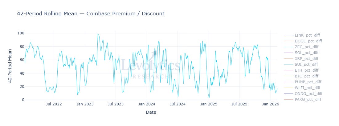
Metric: 7-Day Average of % of Pairs on Coinbase Trading at a Premium (vs Binance)
Current value = 16%
Approximately 6+ weeks of 80%+ of assets trading with a Coinbase discount
Metric Takeaway:
There are still no signs of a strong shift in demand for crypto assets. This is a metric that may only shift after prices pump though, so it’s important to remember this is a possibility. However - for now it tells us to maintain a balanced view in the face of any other bullish data prints.
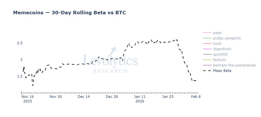
Metric: Average 30-Day Beta for Memecoins
Current value = 1.36
Memecoins on average moving +/- 1.36% for each 1% BTC move
Lowest value in a while
Metric Takeaway:
In moments of panic, you will see that all assets move violently together. This memecoin beta chart shows just that - a moment of widespread fear which resulted in an indiscriminate fire sale of all assets on the board, which can be seen in 30-day beta to Bitcoin speedily ticking downwards towards 1.
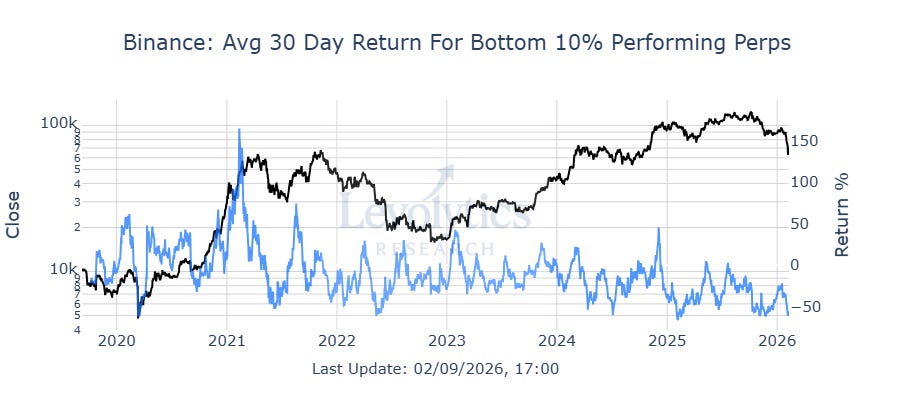
Metric: Average 30-Day % Return for Bottom 10% Performing Perpetual Swap Pairs
Current value = -57%
Metric Takeaway:
This has been one of the worst 30 day periods for underperforming crypto assets since late 2019.
While encouraging for some possible mean-reversion, what’s important to take into account is that since 2024, this metric has a downwards tilt, which means:
The bad times are getting worse over time, as underperforming assets in crypto continue to dump harder than they have historically when price action takes a bearish turn.
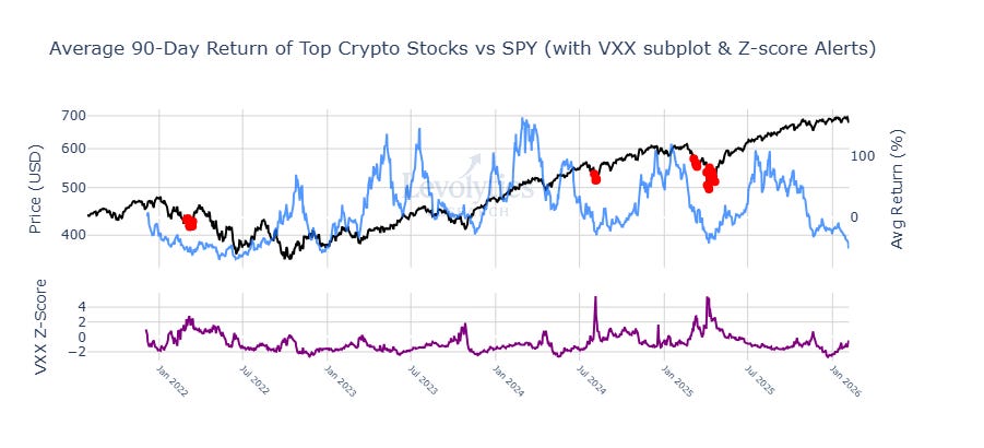
Metric 1: SPY (Black)
Metric 2: Average 90-Day % Return of Top Crypto Stocks (Blue)
Stock list = MARA, COIN, MSTR, RIOT, HOOD
Current value = -46%
Metric 3: VXX Z-Score (Purple)
ETN product that tracks VIX futures contracts
Simple explanation = Product to trade S&P 500 volatility
Metric Takeaway:
This is the worst 90-day period of price action for larger cap crypto stocks since 2023. The market is either breaking, or we’re approaching oversold levels. While the 90-Day VXX z-score isn’t elevated, the 30-day z-score (not shown) recently printed a 3 which is considered high over that timeframe.
Our Approach
Takeaway
The analysis above highlighted the following:
Insult was added to injury during this most recent market-wide drawdown, with a large jump in “down bad” assets in the past week
Flushes in perpetual swaps open interest showed that there were a lot of traders not expecting a revisit of $80,000 for BTC
Once this happened confidence evaporated, panic kicked in, and “safe stop losses” were taken out at $60,000
This intensity of this dump was reflective of the large anxiety overhang in the market, which was evident in the historic spike in the relative anxiety index
Returns for both popular crypto equities and altcoins continue to show signs of possible overextension to the downside, with historically significant poor returns
The price action that has taken place between October and now is exactly why we started this newsletter. Analyzing the market with a deep level of rigor is an important component to any asset management strategy. It is dually important to note that the % of portfolio exposure to the market and the accompanying execution strategy reflect the level of confidence the analyst has in their conclusions.
At Thanksgiving 2025, we landed on the conclusion that the move to $80,000 was a capitulatory event and that we believed it was a possible bottom for the market. However, our level of confidence / execution strategy indicated that our level of confidence was limited, as we only reached a peak of 25% long exposure.
While we were wrong in this instance, the damage we took to our portfolio was relatively limited in the most recent drawdown. What now?
Our inkling is once again that this was another capitulation event, and that there is a decent possibility that $60,000 was the bottom. Our stance towards adding exposure to the market remains unchanged - we are moving slow and waiting for price to show us that there’s momentum under the hood before adding any material amounts to the book.
Macro Approach
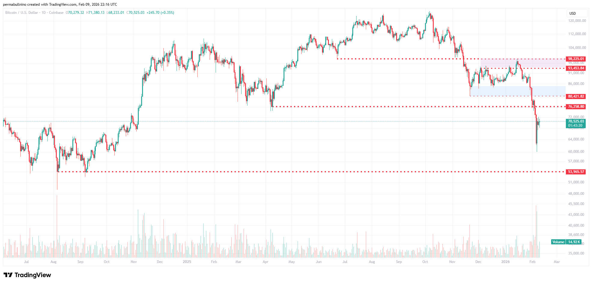
With BTCUSD trading at $70,000 as of writing, we believe that it’s currently sitting in no man’s land. We either want to see:
Reclaim of $76,000 or
Another leg down to $54,000
Reclaiming $76,000 would be undeniably bullish and a possible signal that this dump was a spring-esque event before further upside. However, for now our view is that this chart needs further clarification on a technical basis.
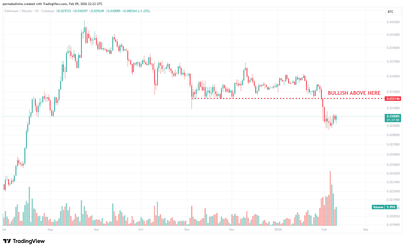
The ETHBTC chart remains simple - we broke down after a long period of consolidation, so for now need to remain cautious and expect further downside. However, a reclaim of the 0.032 level would be a bullish reversal in our eyes. Stay tuned.
Strategy
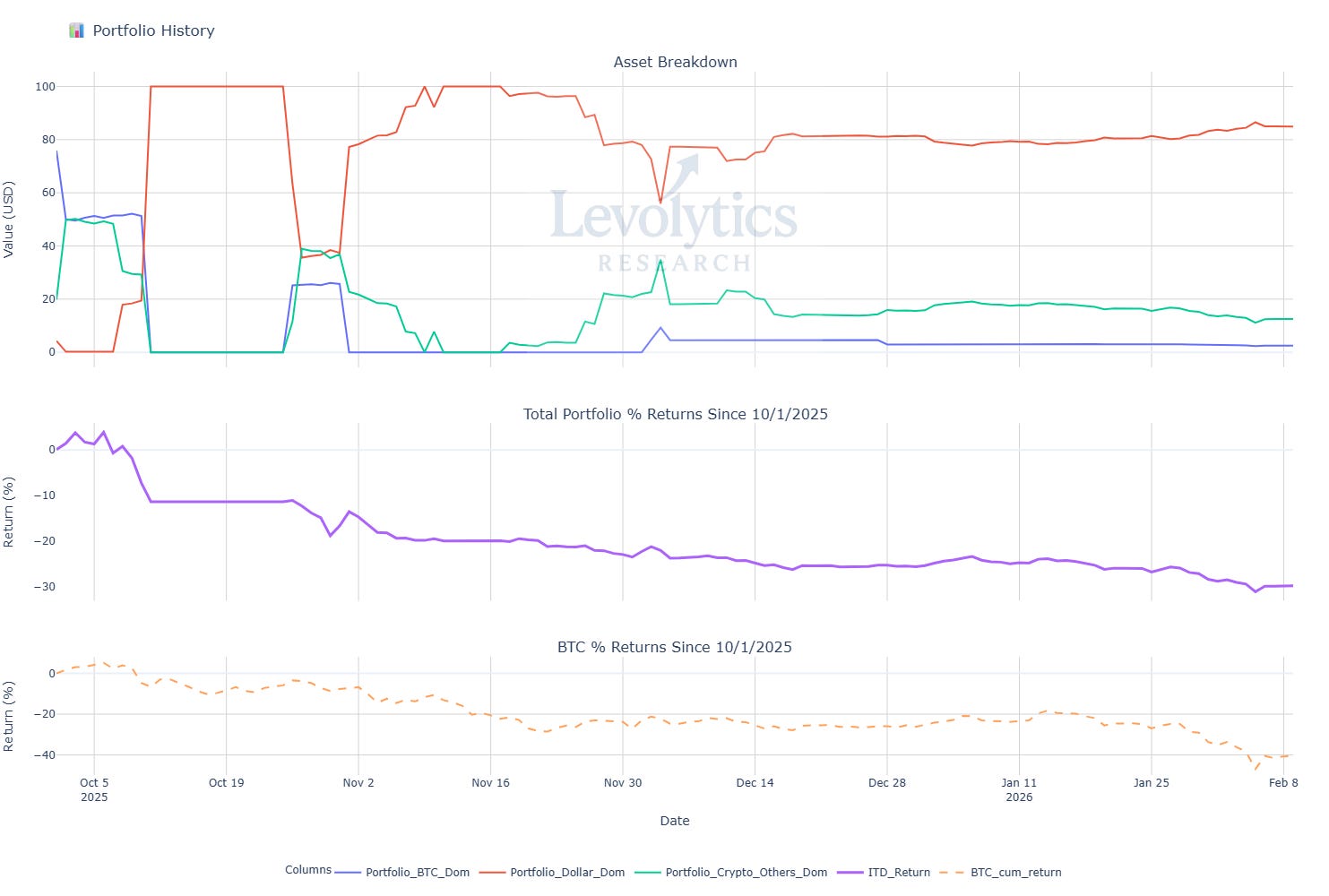
Our current portfolio composition is as follows:
% of Portfolio in BTC = Blue line
Current value: 2.54%
% of Portfolio in Crypto Alts = Green Line
Current Value: 12.53%
% of Portfolio in Cash = Orange line
Current value: 84.93%
Inception to Date Returns = Purple line
Current value: -29.83%
BTC Returns Since Inception = Dotted Orange Line
Current value: -40.57%
Note: Levolytics Research liquid strategy went live October 1, 2025.
Explanation:
As we mentioned above, our strategy has kept our losses largely contained since the Q4 2025 drawdown. We are still kicking ourselves for having too much beta exposure at that time, and we feel that we have traded this slightly better than our ITD performance shows. Nonetheless, the scoreboard is the scoreboard. We have learned from our mistakes, and we continue to be patient. While we continue to remain constructive, our system will require drastic change in either price or time for us to increase exposure. We continue to hold a handful of our favorite assets across a few various thematics.
Sign Off
The market has experienced quite the move from when we last chatted. Quite a bit of damage has been done, and the market-wide losses are staggering. The good assets are down a lot, the bad assets are completely obliterated.
While we continue to remain constructive, we have reached the point where “value” investors begin to step in with longer time horizons, while traders need to protect capital and wait for further information.
That being said, it is a raging bull market in Levolytics HQ as anxiously await the launch of our charting website. Now, each of you will be able to view all of our metrics in real time.
Stay frosty my friends,
Disclaimer
The performance results presented herein reflect proprietary trading activity conducted with internal capital only. No external capital is managed, accepted, or solicited. These results are unaudited and are provided solely for informational and research purposes.
Performance data represents the return on internal capital based on realized and unrealized gains and losses, net of trading fees and transaction costs, but before any taxes or potential operating expenses. The methodology used to calculate performance has been applied consistently; however, results have not been verified by any independent party.
Past performance is not necessarily indicative of future results. All investments involve risk, including the potential loss of principal. The information contained herein does not constitute an offer to sell or a solicitation of an offer to buy any security, investment fund interest, or other financial instrument.
Any opinions, estimates, or forward-looking statements are subject to change without notice and are provided for illustrative or educational purposes only.