Levolytics Research #9
Edition #9 | Written as of November 24th, 2025

Special Note:
Starting Friday, November 28th, Levolytics will be transitioning to a paid subscription model. As such, we will be offering a Black Friday pricing special, which will only be available for a very limited time! We appreciate your continued support, and we are excited about building together into the future.
Onwards and Upwards!
Introduction
Welcome to the newest edition of Levolytics Research! The home of actionable data. If you enjoy the research, please subscribe and share our work with friends and colleagues, and follow @levolytics on X, the Everything App.
Market Update
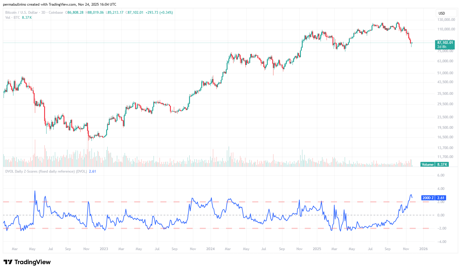
Bitcoin hastily plunged to ~$80,000
Equities also had a shaky week
As holiday season approaches, market participants are wondering if these prices are a gift, or if it’s time to sell more to buy gifts
11/17/2025 Report (Click here to view)
Question of the Week: Was the move to $80,000 Bitcoin capitulation?
Our Take on the Market
Macro Analysis
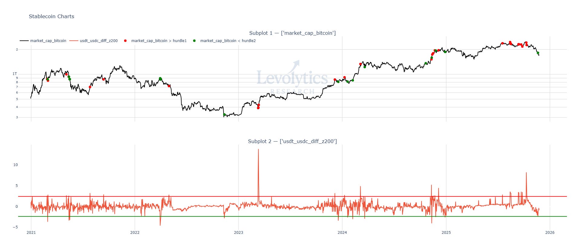
Metric Description:
200-Day Z-Score of the difference between the USDT-USD and the USDC-USD prices
These are the two largest and most liquid stablecoins on the market, and are “true stablecoins” as they are simply backed 1-to-1 by USD or dollar equivalents such as US treasuries
In theory, their prices should not significantly deviate
Red band / dots = USDT trading significantly higher than USDC
Green band / dots = USDC trading significantly higher than USDT
Note: over time, their price disparities have contracted as the crypto market has matured (not shown on chart)
Metric Takeaway:
USDT and USDC serve their own roles within the crypto ecosystem:
USDT: popularly used as collateral for perpetual swap trading, and backed by Tether, a private, non-American entity
USDC: most frequently associated with its use within the DeFi ecosystem, and backed by Circle, a publicly traded, American company. Also redeemable 1-to-1 for USD on Coinbase
These characteristics play relevant roles in the dislocations of their prices during periods of euphoria or panic:
At market tops, traders lever up, spiking the demand for USDT
At market bottoms (which many times occur with large liquidation events), traders run for the exits, causing a spike in demand for USDC
One-off events can occur such as the Silicon Valley Bank panic in 2023, which caused a plunge in the USDC price vs USDT
For the duration of this ~6 month period where BTC traded above $100,000, there were several instances where spikes in demand for USDT took place as volatility died off, and traders were lulled into a perception of safety in taking on leverage. On the drop that took place last week, we finally had a signal of people running for the USDT exits in panic (green dot on top plot took place on November 20th).
One final note is that Ethena’s stablecoin USDe (3rd largest stablecoin in crypto) provides yield via capturing the spread of perpetual swap funding rates. As we previously pointed out - if demand for USDe increases, this also increases the demand for USDT, as USDT will be required to trade perpetual swaps. As panic kicks in, demand for USDe drops significantly because: (1) perceived risks of holding USDe during panic and (2) expected future funding rates to be lower. This causes a drop in the demand for USDT. In theory, Ethena is one of USDT’s largest customers (if not the largest), so their role in USDT supply / demand shouldn’t be ignored.
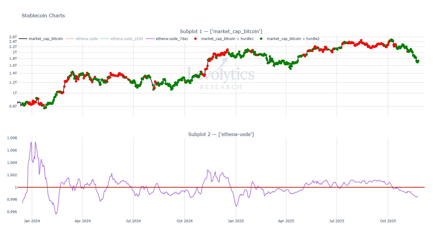
Metric Description:
7-Day Average Price of Ethena USDe
Currently trading below $1 i.e. at a discount
Discount began October 14th
Red dots = USDe trading at > $1 (premium)
Signals positive sentiment as future expectations of funding rate yields minus risks of holding USDe considered positive expected value
Green dots = USDe trading < $1 (discount)
Signals negative sentiment as future expectations of funding rate yields minus risks of holding USDe considered negative expected value
Metric Takeaway:
USDe prices over time are a simple signal for expectations of future funding rates. If there is little demand for USDe, then the market is collectively signaling to traders that funding rates aren’t expected to be high in the near to medium term.
Funding rates display if there is a healthy risk appetite in the market for owning crypto, and USDe is effectively a future that can be traded or held by market participants to make a bet on risk appetite for crypto.
The persistent discount that kicked in on October 14th showed that sentiment had taken a proper nose dive, and material amounts of money were being moved out of USDe (USDe in circulation is down ~50% since beginning of October).
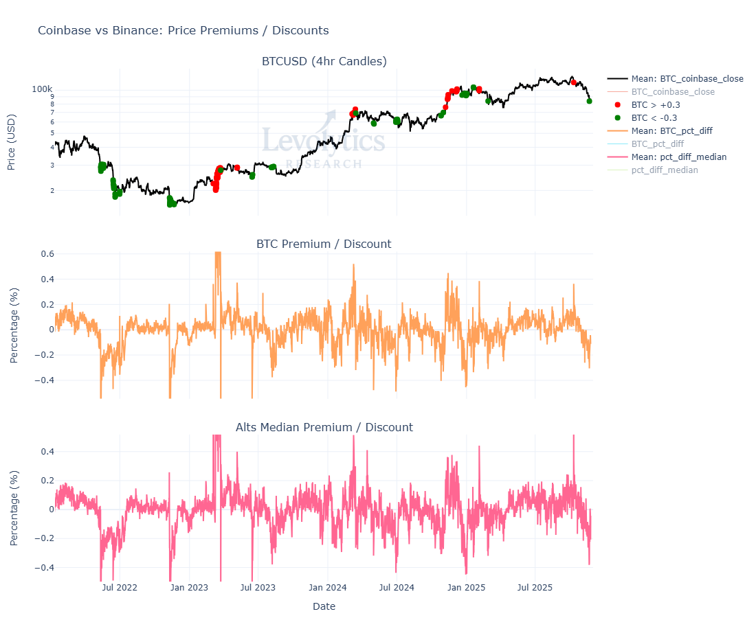
Metric Description:
Subplot 1: BTCUSD Price
Red dots = BTCUSD on Coinbase is trading > 0.3% above the BTCUSDT price on Binance (large premium in Coinbase price)
Most recent red dot = October 10th, 2025
Green dots = BTCUSD on Coinbase is trading < -0.3% below the BTCUSDT price on Binance (large discount in Coinbase price)
Most recent large discount = -0.305% = November 21st, 2025
BTC price on green print = $83,800
Subplot 2: BTCUSD (Coinbase) vs BTCUSDT (Binance) Premium (+ values) / Discount (- values)
Large positive (Coinbase premium) or negative (Coinbase discount) values are areas of disorder in price discovery, which can also be viewed as signals of panic / euphoria
Subplot 3: ALTUSD (Coinbase) vs ALTUSDT (Binance) Premium (+ values) / Discount (- values)
This calculates the median premium / discount across 200+ pairs that are on both Coinbase and Binance
** Note: All Binance USDT prices have been converted to USD.
Metric Takeaway:
This metric was introduced in Levolytics #7 as a way for us to identify periods where Americans reached points of euphoria or disgust as it relates to crypto asset demand.
The expansion in the discount for BTC and altcoins that took place is one of those prints that has previously taken place at historical market bottoms / panic zones. This coinciding with the blow out in USDT / USDC prices is a good sign of “disorderly price discovery” taking place.
Disorder taking over systems that are supposed to be orderly is what we like to see to put in tops or bottoms.
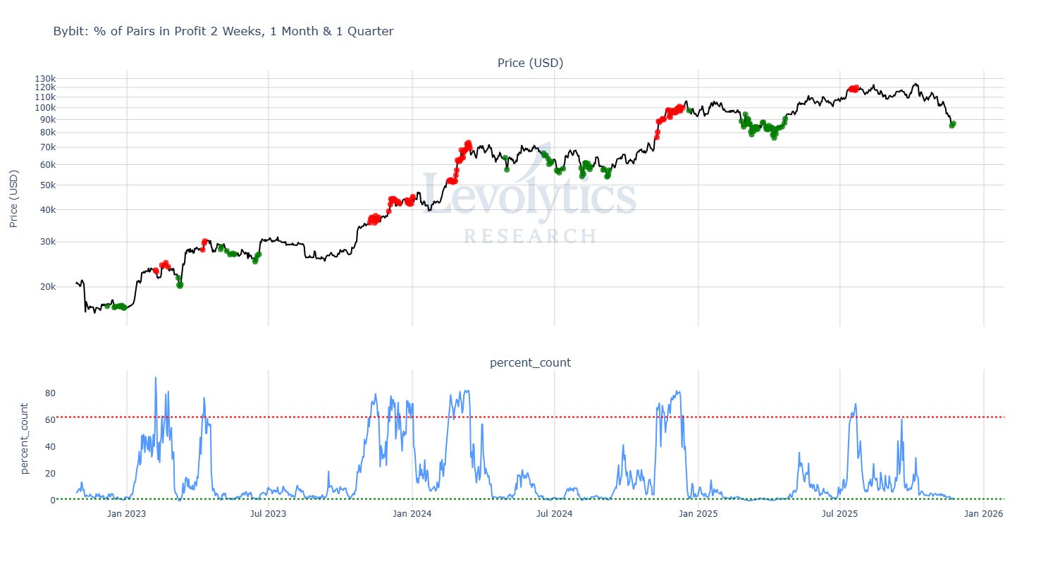
Metric Description:
% of Perpetual Swap Pairs on Bybit that have positive returns over the past 2 weeks, 1 month, and 1 quarter
Note: Values are only counted if an asset is up across ALL 3 timeframes - if it is down across any of the 3 it is not counted
We use this metric to track “momentum or profit intensity” across the crypto market
Green band / dots = Lowest 100 values
Very few assets are showing upwards price momentum
Green dot print on November 21st
Red band / dots = Highest 100 values
Many assets are showing upwards price momentum
Metric Takeaway:
Upwards momentum is effectively non-existent across the entire crypto space. If there are no profits to be taken across multiple timeframes, then the universe of sellers begins to become very limited.

Metric Description:
Subplot 1: BITQ Price vs % of Stocks within BITQ that have abnormally large volume
Uses a 22-Day z-score across all pairs, then calculates % of pairs with larger than 2 z-score
Subplot 2: % of Stocks within BITQ with positive returns over the past month
1 month = 22 business days
Current value = 7.7%
This metric had the largest change over the past week, pushing cross-sectional performance to lowest levels since April 2025
Subplot 3: Average rolling 22-Day % return across all stocks within BITQ vs +/- 2 standard deviations outside the lifetime mean
Current value = -23.7%
Touched top band October 8th, 2025 at 38%
In Levolytics #7, we discussed that historical bottoms took place closer to -20%
Metric Takeaway:
We’ve included this chart 3 editions in a row because we believe that crypto equities puking were an important part in bottoming this market - crypto stocks have performed incredibly well, and the DAT bubble was some nasty work in the realms of greediness.
Everyone must pay.
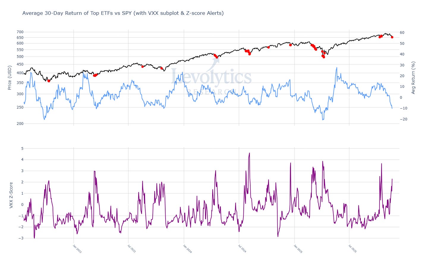
Metric Description:
SPY Price (Black)
Red dots = VXX 30-Day Z-Score > 2
Average 30-Day % Return for Popular ETFs (Blue)
Current Value = -11%
Lowest value since April 2025
VXX 30-Day Z-Score
VXX: ETN that trades short dated futures for VIX (Volatility Index)
Current Value = 2.3
Metric Takeaway:
Crypto wasn’t the only market that experienced volatility last week. This was a global, leg down across the board. For those who believe the damage will be contained in equities, consider this shoe dropped.
Our Approach
Takeaway
The analysis above highlighted the following:
Dislocations in the USDT | USDC markets took place over the past week
A sustained USDe discount provided strong signal that risk appetite in crypto had nose dived following the October 10th liquidation event
BTC and altcoins both traded at historically large discounts last week, which we believe is another possible capitulation signal
A large cross-section of crypto assets have negative returns across numerous timeframes, and at levels where prices have historically bottomed
Crypto equities finally made that final push downwards, as the equity market as a whole took a beating last week
Volatility kicking in for equities provides possibility of final boogeyman being slayed to bottom crypto market
We believe that last week was a classic capitulation bottom, and the confluence across a variety of metrics and even across multiple asset classes is striking.
For value buyers, we believe there’s reason to be excited. Our strategy remains unchanged and momentum focused - as such, we are still waiting for market-leading assets to start moving in a more convincing fashion. Easy mode will eventually arrive, and we want to make sure we aren’t financially crippled when that time arrives.
Macro Approach
Our first discussion surrounding DVOL was in Levolytics #3 when we discussed the possibilities of what looked like a period of volatility expansion. This expansionary period did indeed take place, as last week the 200-Day DVOL Z-Score clocked its highest value since Summer 2022.

IBIT had its largest trading volume week, by a large margin, with over 670 million shares traded.
Micro Approach

Last week was a down-only freight train. If its conclusion marked a potential panic bottom, we don’t expect much lingering around the lows. $100,000 BTC is obvious resistance - given the volatility in the market a $15,000 - $20,000 range wouldn’t surprise us at all.
Strategy
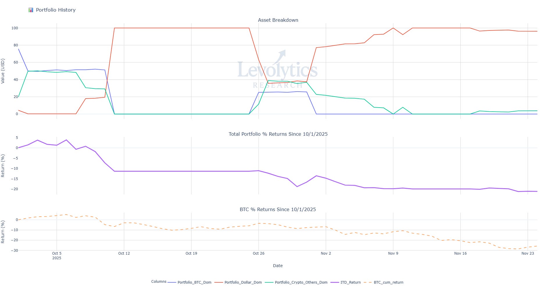
Our current portfolio composition is as follows:
% of Portfolio in BTC = Blue line
Current value: 0%
% of Portfolio in Crypto Alts = Green Line
Current Value: 3.79%
% of Portfolio in Cash = Orange line
Current value: 96.21%
Inception to Date Returns = Purple line
Current value: -21.15%
BTC Returns Since Inception = Dotted Orange Line
Current value: -25.73%
Note: Levolytics Research liquid strategy went live October 1, 2025.
Explanation:
We believe last week should be viewed as constructive from a long-biased perspective, with what appear to be signs of capitulation across numerous market vantage points appearing. As such, we have started slowly adding back exposure. Dipping a toe in, per se. We take a measured approach to market exposure. If upwards momentum returns, we will continue to increase our exposure to the market. The volatility dynamics of crypto offer ample opportunities for outsized returns, and we seek to play the game when we believe the deck is stacked in our favor. As of now, we would summarize our stance as constructively yet cautiously optimistic.
Sign Off
Though too early to tell for certain, last week’s action looked and felt capitulative.
This is supported by multiple market vantages such as stablecoins, ETF volumes, Coinbase discount, and perp returns.
We remain optimistic yet measured in our approach.
Happy Thanksgiving to all of our US-based readers. Remember to take time away from the screens and enjoy the week!
Disclaimer
The performance results presented herein reflect proprietary trading activity conducted with internal capital only. No external capital is managed, accepted, or solicited. These results are unaudited and are provided solely for informational and research purposes.
Performance data represents the return on internal capital based on realized and unrealized gains and losses, net of trading fees and transaction costs, but before any taxes or potential operating expenses. The methodology used to calculate performance has been applied consistently; however, results have not been verified by any independent party.
Past performance is not necessarily indicative of future results. All investments involve risk, including the potential loss of principal. The information contained herein does not constitute an offer to sell or a solicitation of an offer to buy any security, investment fund interest, or other financial instrument.
Any opinions, estimates, or forward-looking statements are subject to change without notice and are provided for illustrative or educational purposes only.
The USDT vs USDC price disparity analysis is fasinating. The fact that USDT demand spikes at market tops while USDC demand rises during liquidation events makes intuitive sense, but having the data to back it up is helpful. Interesting to see how Ethena's USDe is playing into the USDT demand picture too.