Levolytics Research #1
Edition #1 | Written as of September 24th, 2025

Introduction
Welcome to the inaugural publication of Levolytics Research! The home of research that helps you take action, with better data.
Our inspiration for launching this company is simple: we believe there isn’t enough quality, robust, and most importantly - affordable research on liquid markets / trading in crypto. We believe this is an issue for the following reason:
Crypto is an exciting, innovative, but extremely volatile asset class. Naturally this has attracted early adopters (now known as “crypto natives”) who have a tendency to over-index for fundamental analysis.
Involvement in an industry where people are as passionate about the technology and its possibilities isn’t something that should be taken for granted. However, it’s difficult to be excited about the fundamentals when you feel like you’re blindly absorbing 50% +/- portfolio swings.
Thus, our research is geared towards the following stakeholders:
Short-term traders: This cohort of market participants are using a portion of their portfolio to capture returns in shorter term swings in the market, with the aim of either generating income or to build their longer term crypto stack.
Long-term holders: Market participants that only have an interest in buying / selling at strategic medium to long term overextensions in the market, with the goal of loading up on assets they love or selling to upgrade their lives.
In simple terms: if you’re involved in markets, the most important things are (1) understanding the market temperature (i.e. bullish or bearish) and (2) using this knowledge to manage your money in accordance with your trading / investing goals.
Only then, is it appropriate to let fundamentals drive decision making.
With this in mind, there are 3 levels to the asset management stack:
Analysis: Data driven analysis to understand current market conditions.
Execution: A formalized strategy that the trader executes repeatedly.
Performance: The magnitude of returns that a given strategy creates under various market conditions.
Performance = Analysis + Execution
Our goal at Levolytics Research is to help investors with both shorter and longer term investment horizons better understand the markets they log into every day so that their respective execution strategies can be appropriately geared for maximum performance.
Please direct all feedback and queries to Permabull Nino
Our Take on the Market

Metric Description:
avg_14, avg_30, and avg_90 (only shown in legend) are calculations of the 14, 30, 90 day average % returns across all perpetual future pairs on Bybit (500+ pairs)
avg_gap (orange line) takes the maximum and minimum of these 3 values, and calculates the difference between the two of them
This metric aims to identify how returns compare across various timeframes.
Small output values: Returns are very similar across various timeframes, which primarily occurs during consolidation
Large output values: Occur during (1) large market-wide run ups or (2) fire sales induced by panic
Metric Takeaway:
We are currently going through one of the longest periods of market-wide compression in returns since summer 2024. The more time that passes, the more dangerous it is to be short volatility. Fireworks are overdue in crypto markets.

Metric Description:
Calculates the average open interest across every perpetual futures pair on Bybit, then calculates the 7-day z-score of this value to determine if the market is relatively heavy on leverage (large values) or relatively light on leverage (small values)
The basic idea is that markets are healthiest when they are supported by a true cash bid, rather than by borrowed money
Metric Takeaway:
While price compresses, the market is wiping out people that are attempting to lever up before the next explosive move. In sideways markets, this metric would normally signal a good opportunity for mean-reversion. For this particular set up it would signal for a short term opportunity to buy the dip.

Metric Description:
TOTAL3 (black) is the market cap sum of all coins in the top 250 excluding stablecoins, BTC, ETH & SOL
Relative Funding Count (blue) calculates the % of perpetual futures pairs on Binance that have funding greater than the default flat value
This value only spikes if a non trivial amount of people / money are borrowing money to get long in perpetual futures markets, which is indicative of a decent risk appetite outside of the majors
The goal of this chart is to look at the size of market holistically from a value perspective (TOTAL3) versus risk appetite (Relative Funding Count)
Metric Takeaway:
If you look at this chart closely, TOTAL3 exclusively pumps when funding rates are elevated in some capacity. For the sake of being specific, if we say “pump” we mean make new highs in a sustainable leg up manner. This metric gives reason to be optimistic on the prospects of a market-wide pump, as the metric is above 0 but not overextended with an overwhelming majority of perpetual futures pairs trading with elevated funding (values > 65).
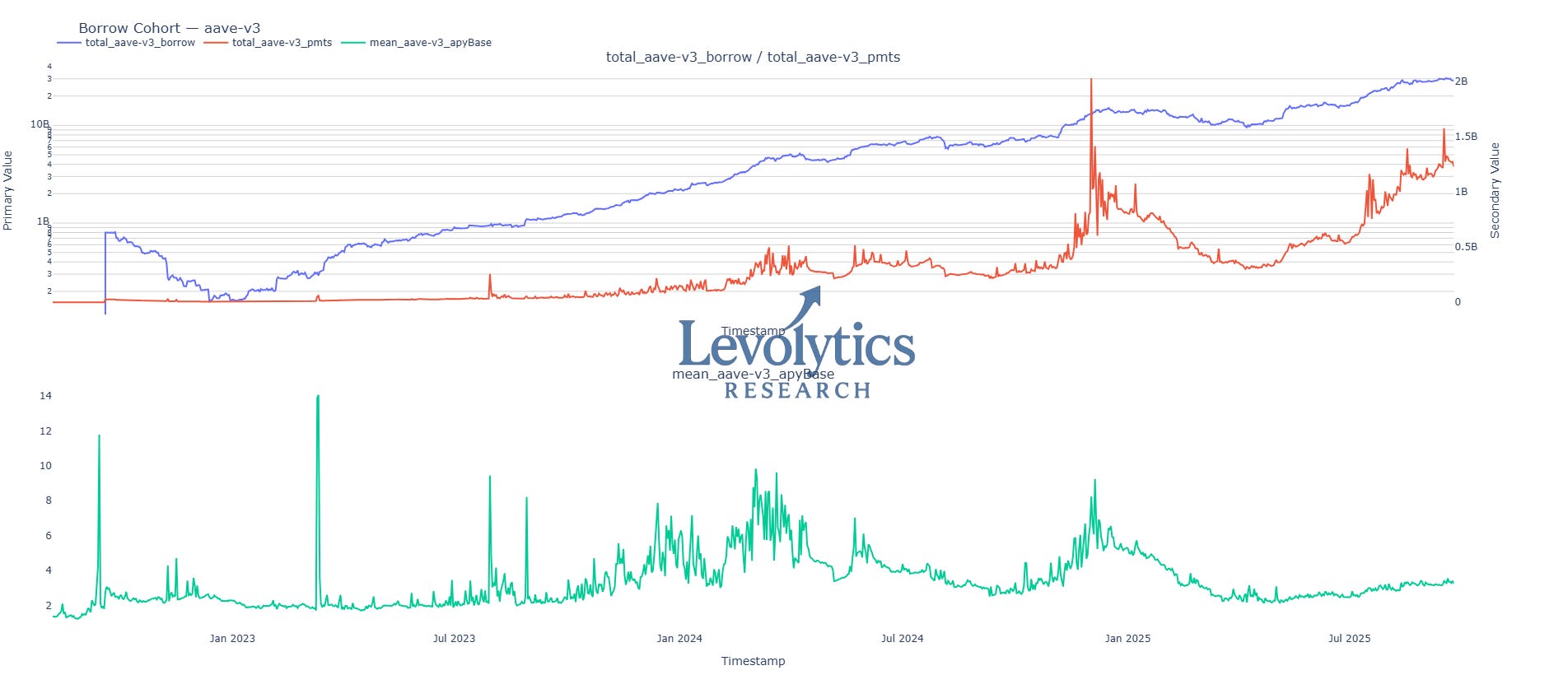
Metric Description:
total_aave-v3_borrow (blue) is the sum of the $ borrowed from the top 50 pools on AAVE-V3 over time (since AAVE-V3 launch)
mean_aave-v3_apyBase (green) is the average annualized cost to borrow for the top 50 pools on AAVE-V3 over time
total_aave-v3_pmts (orange) is the result of the above values multiplied together
By tracking the absolute demand to borrow (blue) and the weighted cost to borrow (green) we can gauge the level of risk appetite in the market
Metric Takeaway:
The previous total $ borrowed top occurred at $15 billion borrowed in December 2024 (blue). After an extended period of lackluster borrowing demand, total $ borrowed has skyrocketed to ~$30 billion, while the cost to borrow (green) is half of what it was back then. This signals that there’s been a large injection of cash into the space and made available for lending on platforms like AAVE. Continued cash injections accompanied with a measured uptick in borrowing demand looking very healthy for crypto markets.

Metric Description:
Note: Binance has approximately ~400 perpetual futures pairs
The goal of this metric (blue) is to gauge how much the top performers are outperforming the laggards over time
Metric Takeaway:
Since the middle of 2023, the top performers have begun to run away from the laggards more and more (look at the higher lows over time). This could be caused by various things:
This just happens in bull markets (verifiable, just need to use a different dataset)
Middle of 2023 was when BTC ETFs got approved and eventually went live, bringing in money that doesn’t just indiscriminately buy any coin
More pairs / dispersion
Nonetheless - it signals that investors need to be diligent in asset selection. The opportunity cost of holding underperformers is increasing over time.
Our Approach
The analysis above highlighted the following:
Returns are compressed across the asset class - it is getting increasingly risky to be short volatility
A lower timeframe clean out of leverage creating an opportunity to play mean reversion
Funding rates displaying a moderate appetite for risk, which is a good set up for altcoins that are consolidating
AAVE lending data is one example of an ongoing sizable cash injection into crypto markets
Gap between top and bottom performers is widening, investors need to be careful and buy assets that are actually performing
Allocation Strategy: We are interested in buying assets that are showing signs of breaking out of consolidation. There are plenty of signs that this is a healthy market and one that is worth owning.
An example of the types of setups we are looking for based on the above is laid out below:

We believe that the market has a bullish bias in the context of what has been months of consolidation. With this in mind - we are trusting lower and higher timeframe break outs. In the worst case we cut a few positions on fake-outs back into the consolidation range, taking on small losses. On the other hand, our upside potential is much larger.
In the chart above we have Asset A breaking out of a consolidation range on the 4hr timeframe. Below we’ll now zoom out a bit further to the daily timeframe:
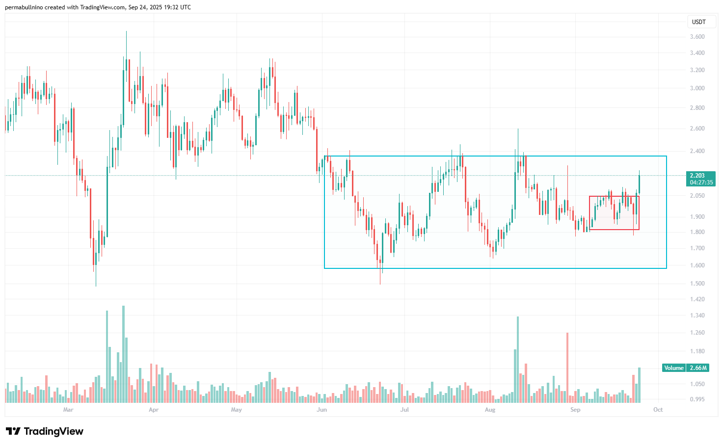
As you can see in the daily timeframe, it’s also trading within a larger consolidation range. We can also see an uptick in daily trading volume. Compression over multiple timeframes + lower timeframe break out + increase in volume is a set up we want to trade here.
Everyone takes different set ups and manages risk differently - but based on our analysis within, we believe this is an example of a strategy that is well-suited for current market conditions.
Good luck out there team,
Team Levolytics